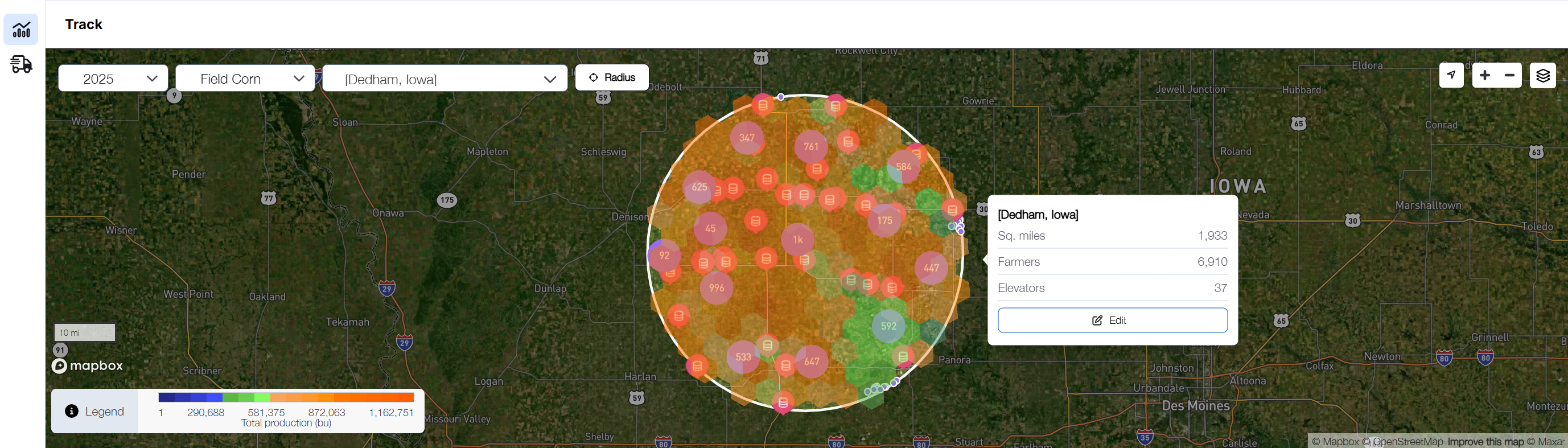
Once logged in, you start at the Grain Intelligence dashboard. Your first step is to select the year and crop via the drop down menus at the top left of the map. Please note that currently only Field Corn and Soybeans are supported, but these offerings will expand in the future.
Next select the geographic area that you would like to focus on by choosing your DRAW AREA from the drop down. During your initial account set-up with the DTN implementation team, you will create a draw area that will be available to select from this drop down.
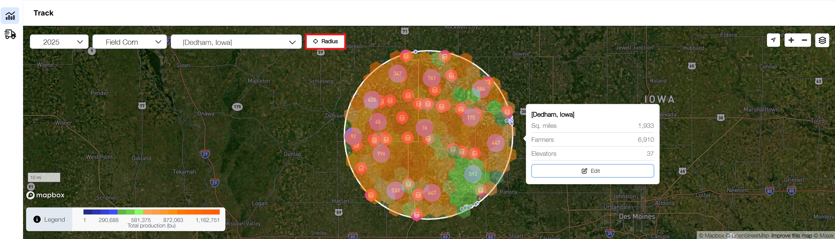
To create a new draw area apart from those available in the Draw Area drop down, zoom into the desired geographical area by using the zoom-in and zoom-out buttons at the top right corner of the map and select the Radius button located in the map menu.
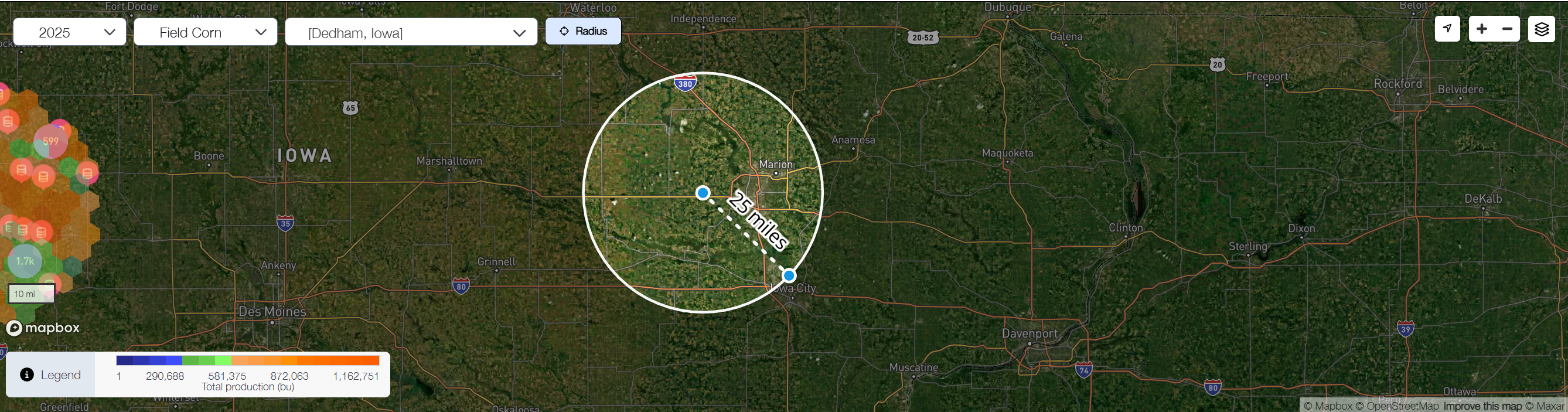
Click on a starting point on the map and drag your mouse out until the desired area is encompassed. As you drag your mouse away from the center, a mileage indicator will appear to show the distance covered.
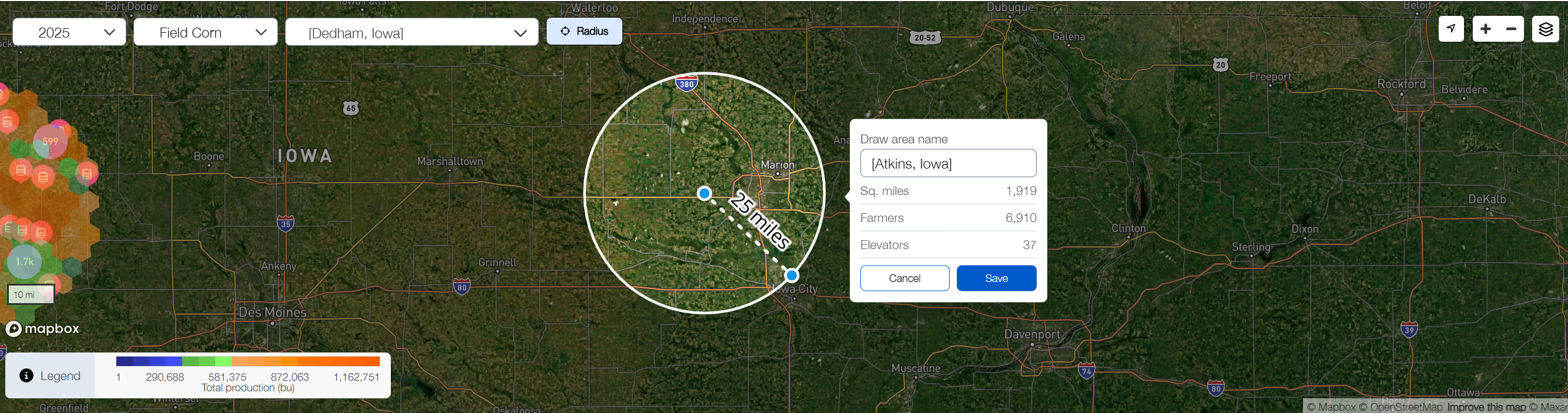
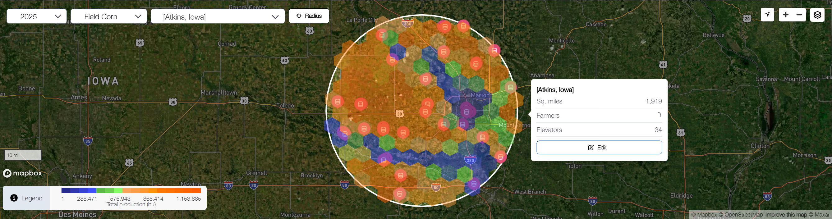
Click your mouse to finish defining the radius. This will open a box with an input field for you to name your newly created draw area. By default, it will be named after the city closest to the center of the radius, but you can fully customize the name. You’ll also see key details about the selected area, including its size in square miles, the number of farmers, and the number of elevators within it. After typing in the name for your new draw area, click Save.
Now that you have defined your draw area, your dashboard map will show live data specific to this area. The color coding shown is based on the density of production. The darkest orange areas indicate the areas of highest production, versus the darkest blue areas where the least amount of production is occurring.
The layers button at the top right corner of the map allows you to select what information is displayed on the map by selecting different items from the list, as well as customizing the legend shown at the bottom left corner of the map.
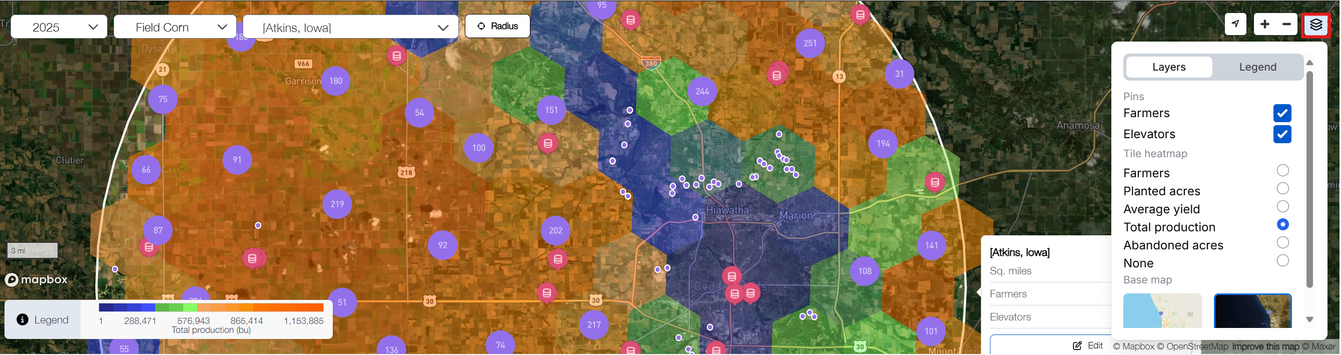
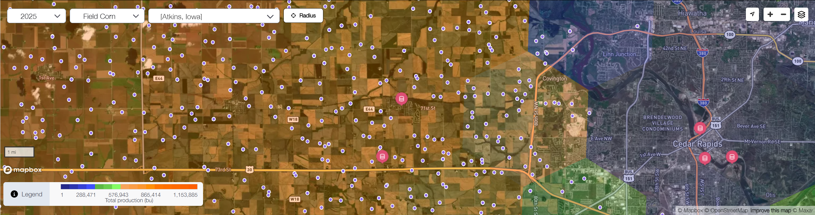
From here, you can zoom further in to transition from this heat map style visual to a more pinpoint view of the actual elevators and farms within the draw area. Detailed information about each pin point icon is available in the Legend as mentioned above. In general, the purple icons represent individual farm operations and the pink icons are elevators.
Now that you have created a draw area, you can begin analyzing and reviewing the available data below the map.
Related articles: